The Bare Bones Game System published by DwD Studios – the rules-lite, role-playing game featured in the previous post – also required a cover art. I was commissioned to produce a comic-style scene of the characters in the fantasy template cards appropriating loot.
Here is the step-by-step process of how the cover came to be.
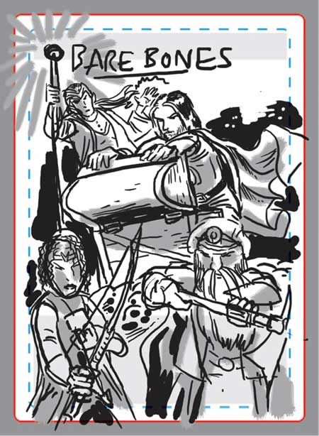
Thumbnail sketch
I start with a rough sketch of the cover in black and white, overlaid with the margin and bleed marks.
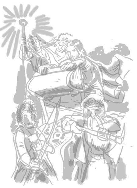
Digital pencils
The previous sketch is used as a rough pencils layout by reducing the transparency.
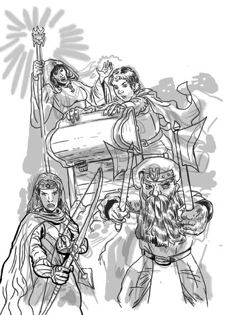
Digital Inks
Inks are applied on top of the pencils. In this case, I do not pencil with a lot of detail.
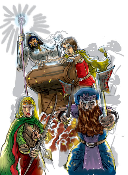
Figures are coloured in
Colours are applied under the inks. Actually by this time I’ve coloured the background, but I’ve blocked it out with a white layer so you could see the foreground colours. What does the background look like?
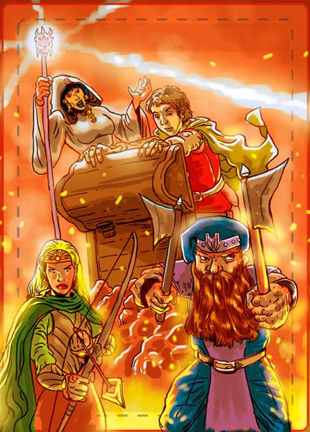
Background and effects
The background looks like this – originally. However, after DwD Studios overlaid the title and logo on the artwork it was discovered that it was too bright. The title and logo were drowned by the bright red colours. So, I digitally corrected the colours to come up with the final artwork:
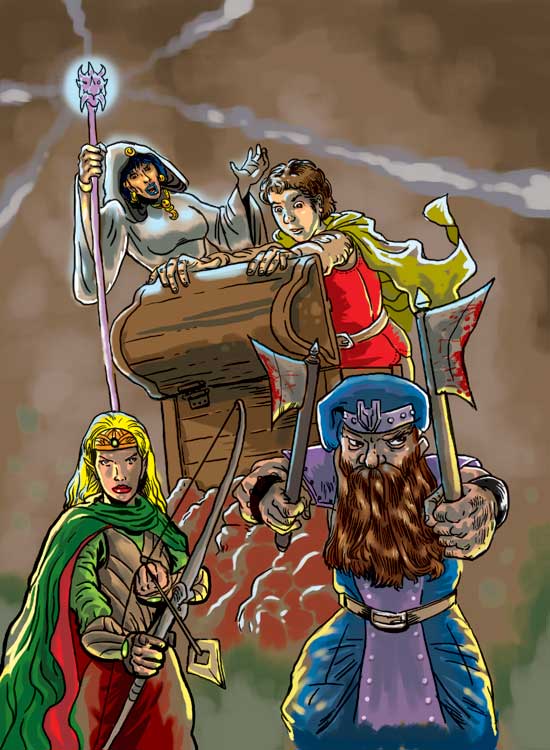
The final image
The approved artwork has a darker, browner hue and tone to it!
