I’ve been trying to code the CSS file for the weblog all morning. I woke up and thought, how nice it would be if the site was optimised to a width of 1024 pixels.
So I tinkered. And after altering and jury-rigging a bit of code here and a snippet of script there in the CSS file, I have arrived at a temporary solution before I needed to stop working on it.
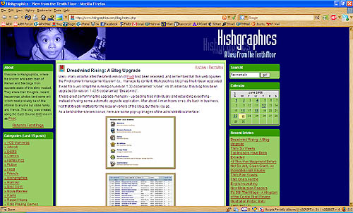
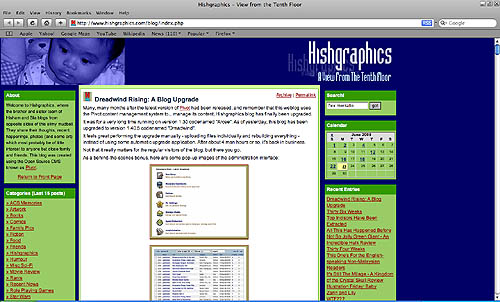
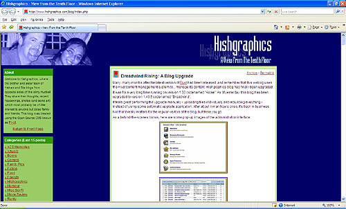
Here’s how it looks like using three different browser types on a 1200px by 800px screen:

Firefox 2.0.0.14

Safari 3.1

and finally… Internet Explorer 7.0 (sigh)
The left column is still there. It’s just overlaid by the centre column. I shall return to fix this for IE users.
